

TL;DR:
- Effective booking dashboards focus on 5 to 7 key metrics tailored to specific roles, enhancing decision-making clarity.
- Preparing by mapping data sources, conducting role interviews, and auditing existing setups ensures successful redesigns and reliable data.
If you manage short-term rentals across multiple properties, you have almost certainly opened a booking dashboard and felt immediately overwhelmed. Too many metrics, conflicting data points, filters that reset without warning, and no clear signal about what actually needs your attention. Knowing how to streamline booking dashboards is not simply a technical exercise. It is what separates property managers who spend mornings reacting to chaos from those who spend them making deliberate, confident decisions. This guide covers exactly what you need to prepare, design, and maintain dashboards that genuinely improve how you operate.
Table of Contents
- Key takeaways
- What you need before redesigning your dashboard
- Designing a simpler, more effective dashboard
- Common mistakes that undermine dashboard quality
- Measuring the impact of your changes
- My perspective on booking dashboard design
- How Guestadmin supports better dashboard management
- FAQ
Key takeaways
| Point | Details |
|---|---|
| Limit your core metrics | Displaying more than 9 elements causes users to process rather than act, so focus on 5 to 7 key figures. |
| Build role-specific views | Front-desk staff and revenue managers need different data; one dashboard for everyone creates confusion. |
| Define a metric contract | Before redesigning, document each KPI’s source, calculation, update frequency, and owner. |
| Audit before you redesign | Map current pain points and data sources before making any changes to avoid recreating the same problems. |
| Measure success post-launch | Track decision time, user adoption, and revenue per available room to confirm improvements are real. |
What you need before redesigning your dashboard
Most dashboard projects fail not in the design phase, but in the preparation phase. Before you touch a single widget or reconfigure a single filter, you need a clear picture of what data you are working with, who needs to see what, and where your current setup is falling short.
Map your data sources and integrations
Start by listing every system that feeds your booking dashboard. This typically includes your property management system, online travel agency channels, payment processors, and any compliance or guest registration tools. Real-time data integration across booking engines, your PMS, and revenue management is fundamental to operational efficiency. If any of these connections are unreliable or delayed, your dashboard will reflect stale information regardless of how well it is designed.
Know your users and their needs
A front-desk team member needs to see today’s arrivals, outstanding check-ins, and room status at a glance. A revenue manager needs average daily rate, occupancy trends, and forward-looking booking pace. Applying role-based widgets to separate these views prevents either user from drowning in irrelevant data. Run brief interviews with each team role before redesigning. Ask them which three decisions they make daily and which data points drive those decisions.
Audit your existing dashboard
Walk through your current dashboard as if you were a new team member. Note every metric you cannot immediately explain, every filter that behaves inconsistently, and every section you scroll past without reading. This audit gives you a concrete list of what to remove, consolidate, or redesign.

The table below summarises what to have in place before starting:
| Requirement | Why it matters |
|---|---|
| Live data integrations confirmed | Prevents stale or siloed data reaching the dashboard |
| User role interviews completed | Ensures each view reflects actual decision-making needs |
| Current dashboard audit documented | Identifies duplications, gaps, and friction points |
| Mobile compatibility assessed | Mobile-ready dashboards with real-time sync are now standard practice |
| Software feature list reviewed | Confirms your platform supports filters, alerts, and role-based access |
Designing a simpler, more effective dashboard
With your preparation complete, you can move into the design phase. This is where most of the operational gains are made, and it requires discipline to resist the temptation of adding more rather than less.
Follow a decision-first design process
-
Define your 5 to 7 core metrics. Displaying more than 9 elements causes users to spend more time processing than acting. For most property managers, the core set includes occupancy rate, revenue per available room, arrivals and departures today, outstanding guest registration tasks, and average booking lead time.
-
Create a metric contract. Before building anything, define each metric’s business meaning, data source, calculation method, update frequency, and the name of the person responsible for its accuracy. This prevents you from building a dashboard around data that is available rather than data that is useful.
-
Apply a two-layer structure. Use an overview layer that displays aggregated figures at a glance, with a detail layer accessible on demand. This two-layer design reduces cognitive load without hiding information that teams may occasionally need.
-
Use clear visual hierarchy and status indicators. Colour coding for overdue tasks, amber warnings for approaching thresholds, and green confirmations for completed compliance submissions help users scan rather than read. Spend time getting these indicators right because they replace the need for lengthy explanations.
-
Make filters consistent and visible. Filters must be visible, persistent, and update all panels simultaneously. Nothing erodes trust in a dashboard faster than a date filter that updates one chart but leaves another showing last month’s data.
-
Design for mobile from the start. Mobile adaptations should prioritise key metrics with simplified visuals and provide easy navigation to detailed views. If a team member cannot check occupancy from a phone during a property visit, the dashboard is only half useful.
-
Target a load time under 2 seconds. Dashboards that load under 2 seconds support operational use. Pre-cache frequently viewed data and limit the number of visual elements per screen to hit this target.
Pro Tip: Test your redesigned dashboard with a user who was not involved in building it. Give them a specific question to answer using only the dashboard. If they cannot do it in under 30 seconds, the design needs further simplification.
Booking dashboards for property managers work best when they simplify compliance workflows alongside operational data, reducing the number of tools your team needs to consult in a single shift.
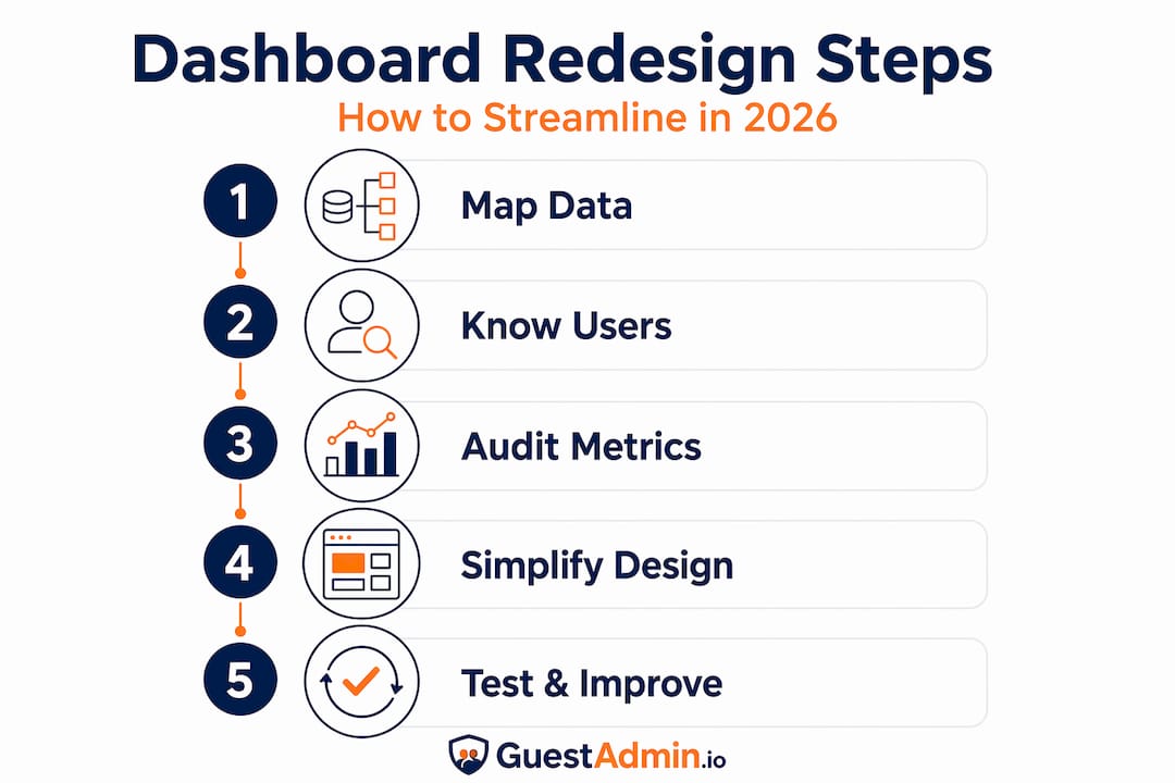
Common mistakes that undermine dashboard quality
Even well-intentioned redesigns can fall short if certain pitfalls are not actively avoided. Understanding these mistakes in advance saves significant rework later.
The biggest offender is the phantom metric. 73% of dashboards fail because they measure the wrong things or suffer from information overload. A metric earns its place on a dashboard only if it triggers a specific decision. Tracking the number of page views on your booking engine listing, for example, tells you something interesting. It does not tell you what to do on a Tuesday morning.
Other common mistakes to watch for:
- Inconsistent filters. When a date range update changes some panels but not others, users stop trusting the data entirely.
- Stale data with no timestamp. Always display when each data point was last updated. Users who cannot verify data freshness will default to spreadsheets.
- Too many form fields in booking workflows. 40% of users abandon booking funnels due to excessive form fields and slow load times. Keep required inputs to the minimum needed for compliance and confirmation.
- No alert system. A dashboard without dynamic alerts requires users to check it constantly. Build triggers for anomalies such as a sudden drop in bookings or a missed compliance submission.
A good dashboard is a tool for action, not just observation. If a metric does not trigger a decision, it does not belong on the screen.
Pro Tip: Run a daily data validation routine, even a brief five-minute check, to confirm that all integrations are syncing correctly. Catching a broken connection on Monday morning is far less damaging than discovering it on Friday afternoon.
For managers handling multiple units, bulk update tools across property portfolios eliminate manual data entry and significantly reduce the risk of dashboard errors caused by inconsistent manual inputs.
Measuring the impact of your changes
A redesigned dashboard that feels better is not enough. You need evidence that it is performing better, and that requires defining your success criteria before going live.
Set clear success metrics
Decide in advance what improvement looks like. Useful indicators include:
- Reduction in average time to make a specific decision (such as confirming a late check-in)
- Increase in revenue per available room attributed to better yield decisions
- Reduction in compliance errors or missed submissions
- User adoption rate across different roles
Run regular dashboard audits
Regular dashboard audits with checklists improve reliability and build user trust over time. Schedule a monthly review where you walk through each metric, confirm its data source is functioning, and ask users whether it still reflects their actual decision-making needs. Metrics that are no longer acted upon should be archived rather than left on screen.
Collect structured user feedback
Ask each role to rate the dashboard on three questions: How quickly can you find what you need? How confident are you in the accuracy of the data? What is still missing or confusing? This structured feedback reveals issues that observation alone would miss.
The table below compares typical scenarios before and after a thoughtful redesign:
| Scenario | Before redesigning | After redesigning |
|---|---|---|
| Morning briefing preparation | 15 minutes pulling data from multiple sources | 3 minutes reviewing a single overview screen |
| Identifying a compliance gap | Discovered reactively, often after a deadline | Alert triggered automatically when threshold is breached |
| Revenue decision making | Based on yesterday’s exported report | Based on live ADR and forward booking pace |
| Mobile access | Dashboard not usable on a phone | Key metrics visible and navigable on any device |
| New staff onboarding to dashboard | Several hours of training needed | Intuitive layout understood within one shift |
Connecting your dashboard directly to rental compliance monitoring means that operational oversight and regulatory obligations share a single source of truth, which eliminates the need for a separate compliance check process.
My perspective on booking dashboard design
I have seen property managers invest weeks into redesigning dashboards, only to end up with something equally cluttered because they started with the wrong question. They asked “what data do we have?” instead of “what decisions do we need to make?”
The dashboards that actually transformed operations in teams I have worked with all shared one quality: ruthless restraint. Every metric that could not be tied to a specific, recurring decision was removed. The initial reaction from some team members was resistance. They worried about losing visibility. In practice, the opposite happened. People stopped treating the dashboard as a reporting tool they checked periodically and started treating it as an operational guide they relied on throughout the day.
The other lesson I would share is that maintenance matters as much as design. A beautifully designed dashboard that is not audited regularly will gradually accumulate phantom metrics, broken integrations, and outdated visual logic. Assign someone ownership of the dashboard the same way you would assign ownership of a compliance process. Without accountability, even the best designs drift back towards noise.
Embrace the discomfort of removing metrics that feel important but are not acted upon. That discomfort is usually the sign you are making the right decision.
— Alex
How Guestadmin supports better dashboard management
Guestadmin is built specifically for property managers and hospitality operators in the European short-term rental market who need their booking and compliance data in one place, without the administrative burden of managing it manually. The platform’s real-time booking dashboards give you an immediate view of occupancy, guest registration status, and upcoming submissions, all updated automatically and accessible from any device.
Role-based views mean your front-desk team sees what they need for guest arrivals while your compliance officer monitors submission deadlines and data accuracy. Guestadmin integrates with leading PMS and OTA platforms, so your dashboard reflects live data rather than yesterday’s exports. For managers overseeing multiple properties, the multi-property management tools and software comparison guide can help you identify the right configuration for your portfolio. Book a conversation with the team to see how the platform fits your specific operation.
FAQ
How many metrics should a booking dashboard show?
Limit your primary dashboard to 5 to 7 key metrics. Displaying more than 9 elements causes users to spend more time processing information than acting on it.
What is a metric contract and why does it matter?
A metric contract defines each KPI’s business meaning, data source, calculation, update frequency, and owner. It prevents dashboards from being built around available data rather than decisions that actually need to be made.
How do I improve dashboard efficiency for multiple properties?
Use role-based views, consistent filters, and bulk update tools to manage data across your portfolio. Real-time data sync and daily validation routines prevent stale or siloed information from reaching your dashboard.
How fast should a booking dashboard load?
Operational dashboards should load in under 2 seconds. Use pre-caching and reduce the number of visual elements per screen to maintain this performance consistently.
How do I know if my dashboard redesign has worked?
Track measurable outcomes such as reduced decision time, improved compliance submission rates, and increased user adoption across roles. Regular audits with checklists and structured user feedback confirm whether improvements are holding over time.